
Visualization models |
USEPA |
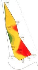
The more sophisticated 3D modeling programs allow the user to visualize the data and manipulate it in a variety of ways. At left, the model is viewed like a map from above, with coring locations indicated. Color zones indicate the concentration of lead in surface sediments, from low (green) to high (red). |
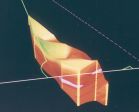
Here the model is viewed from an overhead oblique angle, with deeper sediments visible on the sides. |
Shoreline > |
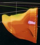
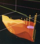
The model in side view (from the shore). The lowest lead concentrations are near the surface (recent sediments). Higher concentrations are below (older sediments). Vertical rows of yellow dots are core sub-samples. Note the lead "hot spot" (purple) at right middle. |
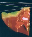
The model in transparent side view. Other zones of higher concentration (red) are revealed within the sediment mass. All 10 core profiles are also visible. |
Model with the upper half removed to simulate the result of dredging down to the hot spot level. This indicates the distribution of lead on the exposed surface. The amounts and percentages of lead removed by each dredging increment were also calculated by the program. |